VR Main Menu
Early 2019
Münster School of Design
Endeavour
For a virtual reality app concept I did in the fifth semester of my design degree, I needed a suitable main menu and context information system. The whole system of navigation and functionality had to be designed and prototyped for a presentation of the app prototype.
Solution
The following case study is split into different parts. To begin with, you can make yourself familiar with the final system. Second you will dive into the general problem and learn about project specific constraints and parameters. Next you will see some general explorations of how a VR menu could be built. Afterwards you get to know different iterations of the menu and the context information system and the end shows all possible states and use cases of the system.
Scope
Virtual Reality, User Experience Design, User Interface Design
-
-
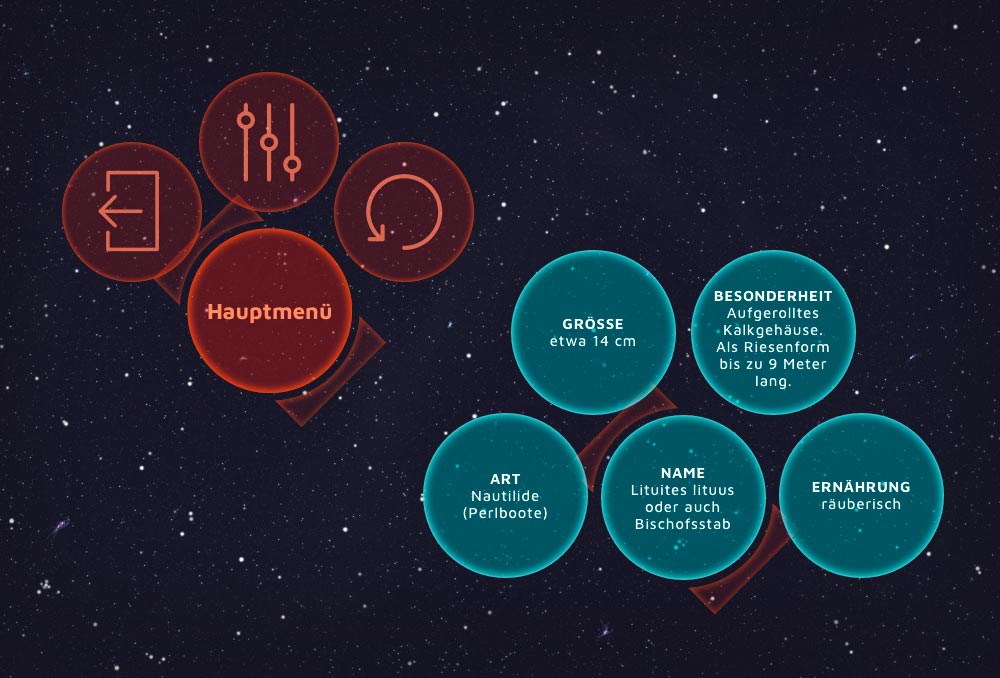
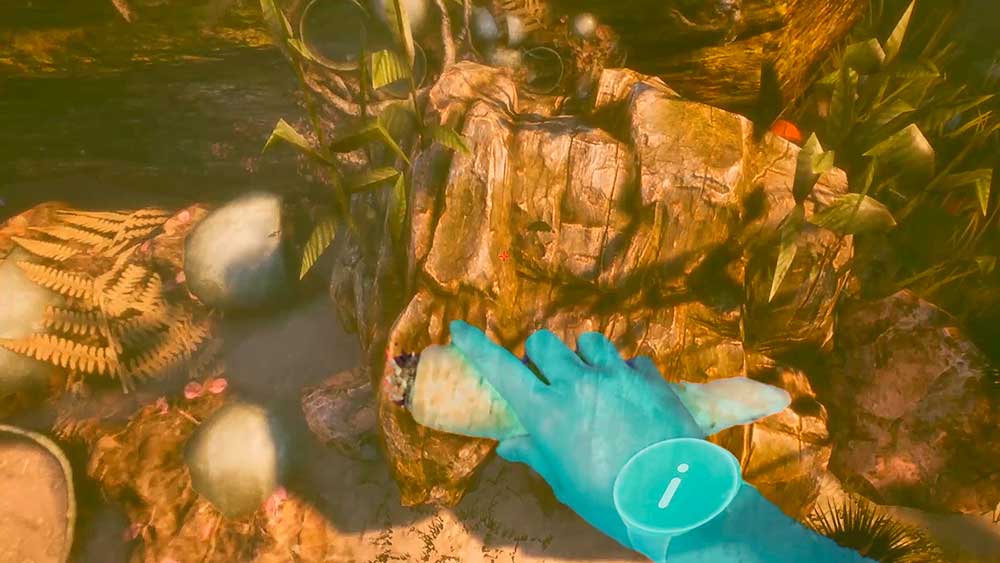
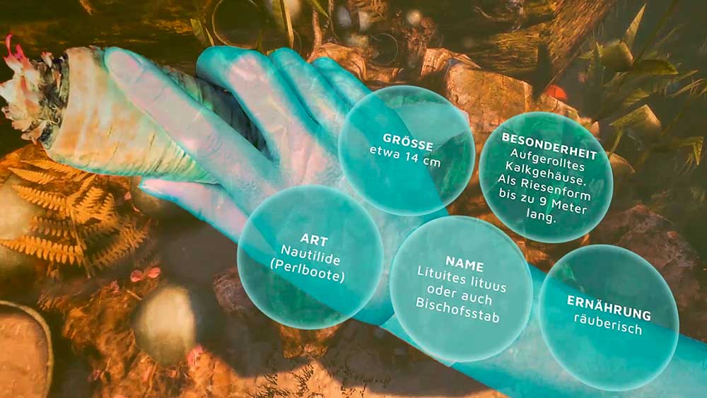
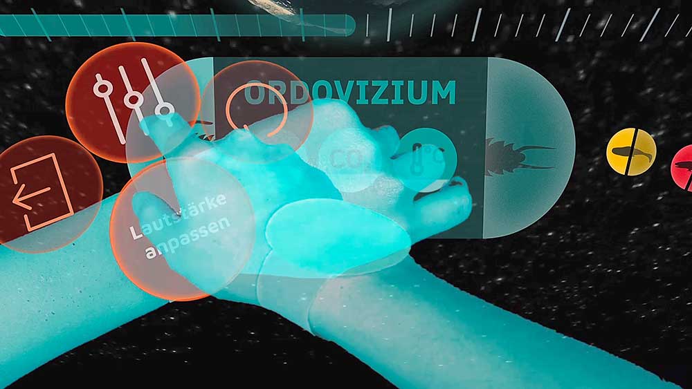
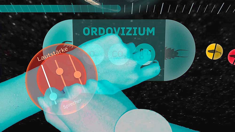
Below you can see the final outcome and animation of the video as well as the implementation inside of the VR prototype. This is what was presented as an end result. In the end of this page there are all finished elements of the system.
-
-
-
-
-
Main Menu Creation Process:
-
-
-
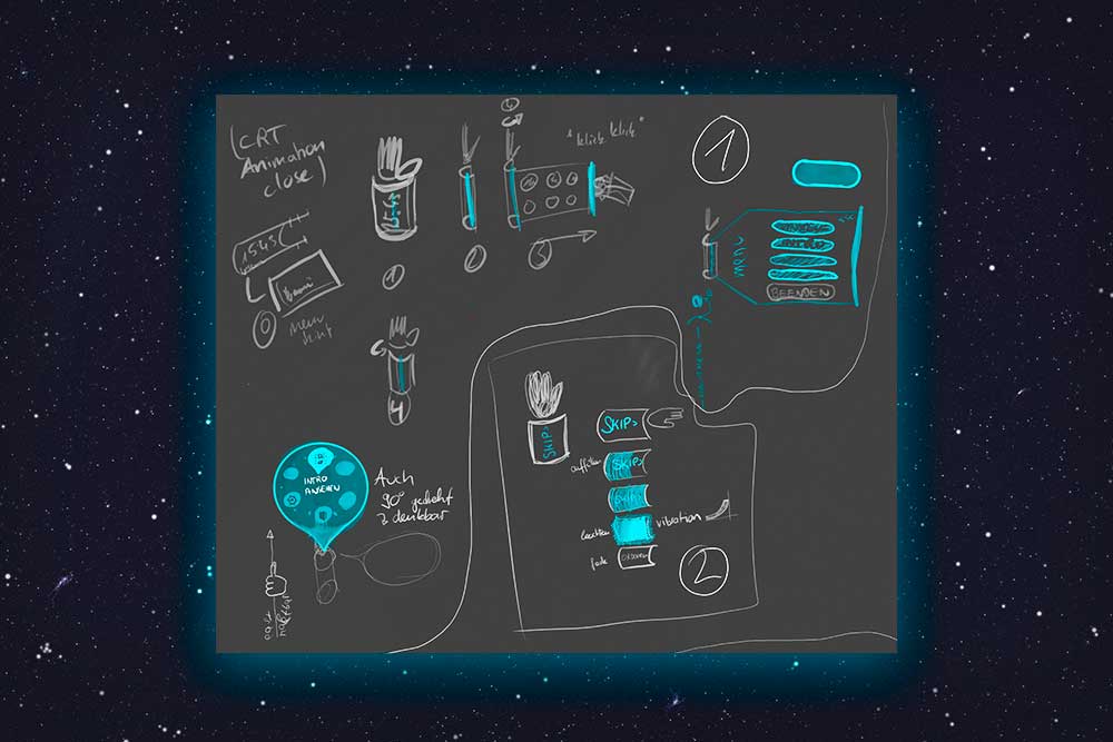
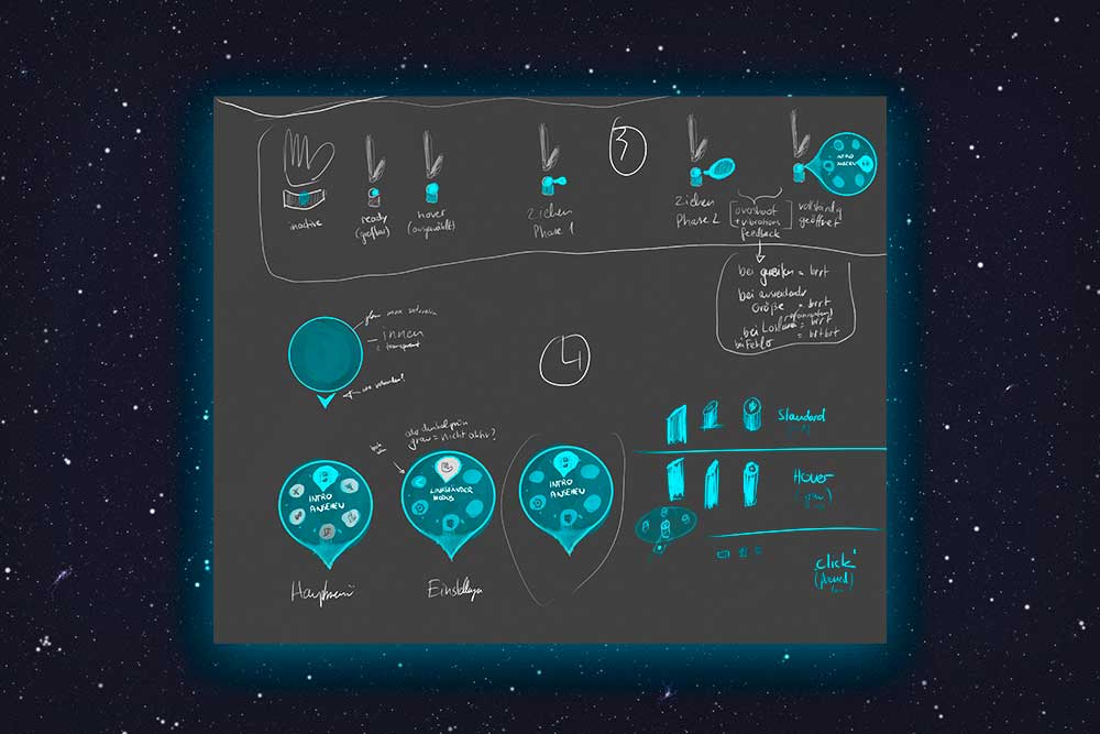
The images above show a general ideation of the system. In this stage, at the very beginning of the project, I just tried different ideas and concepts on how a menu or context information system might look like and work. The most important factor was that it should be somehow easy to use but at the same time feel really sci-fi and futuristic.
-
-
-
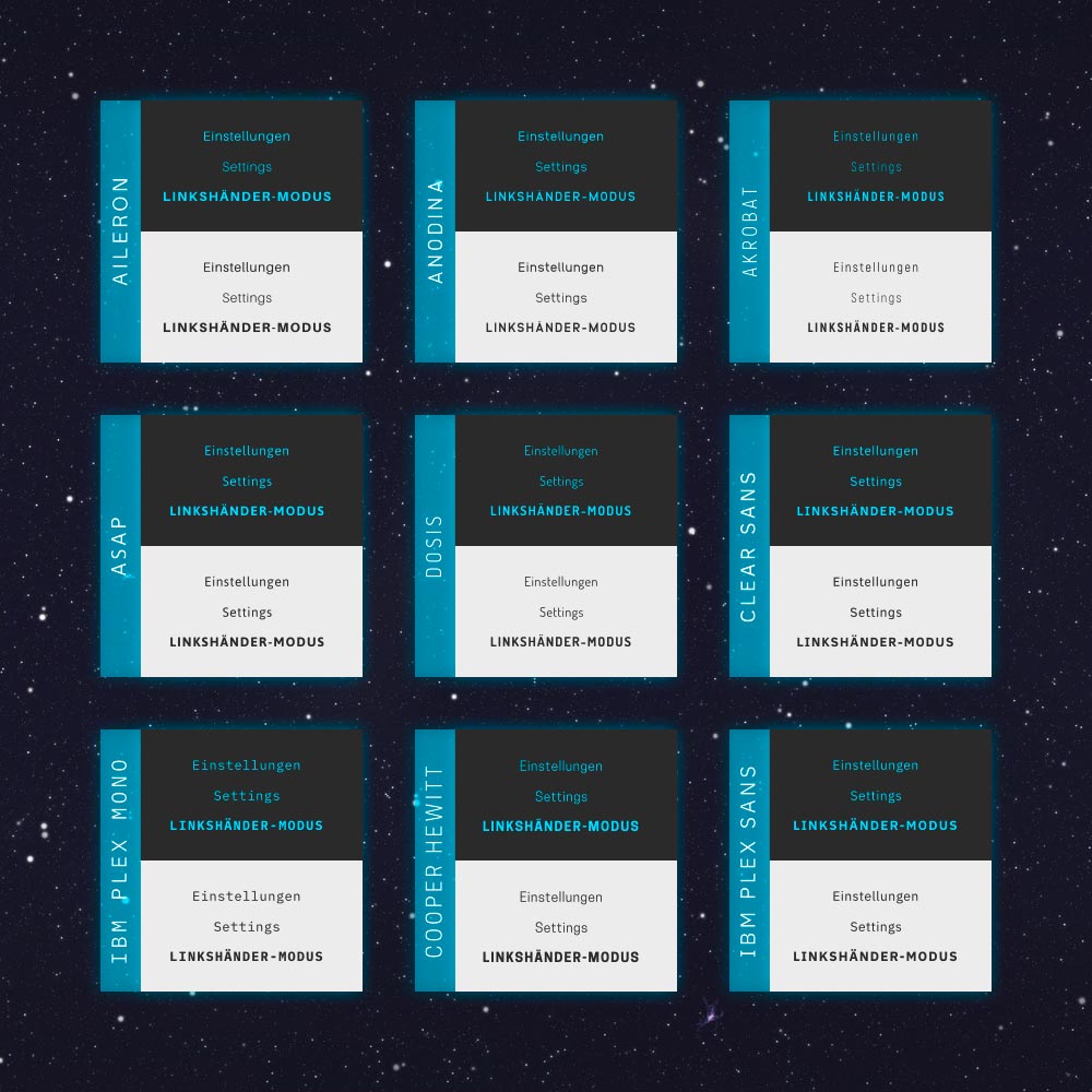
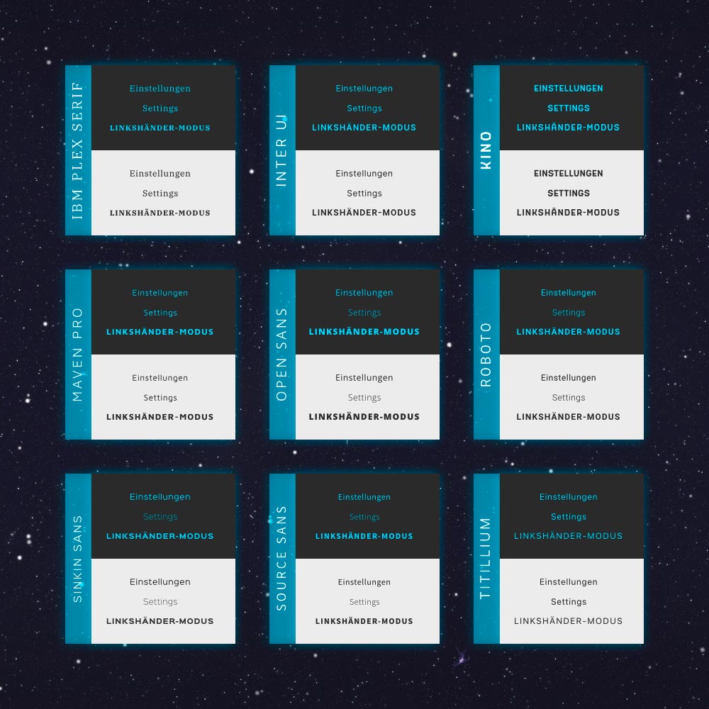
After having some general ideas on how a menu could be used and what elements might work to match the demands of the app (futuristic aesthetics and ease-of-use). The next task was to select a typeface for the menu (and whole application in general). This process needed to be thought of carefully, because we (the VR app team) wanted the typeface to support our overall style. Together with the other members of the team, we decided on the "Maven Pro" typeface for two reasons: (a) It is very well legible at low resolutions due to the lack of details like fancy terminals or serifs and its simple letter forms. And (b) it has a futuristic style.
Some of the other typefaces might have been a possible choice, too, but Maven Pro delivered best results in low resolution tests, maintaining the readability and distinctive style.
-
-
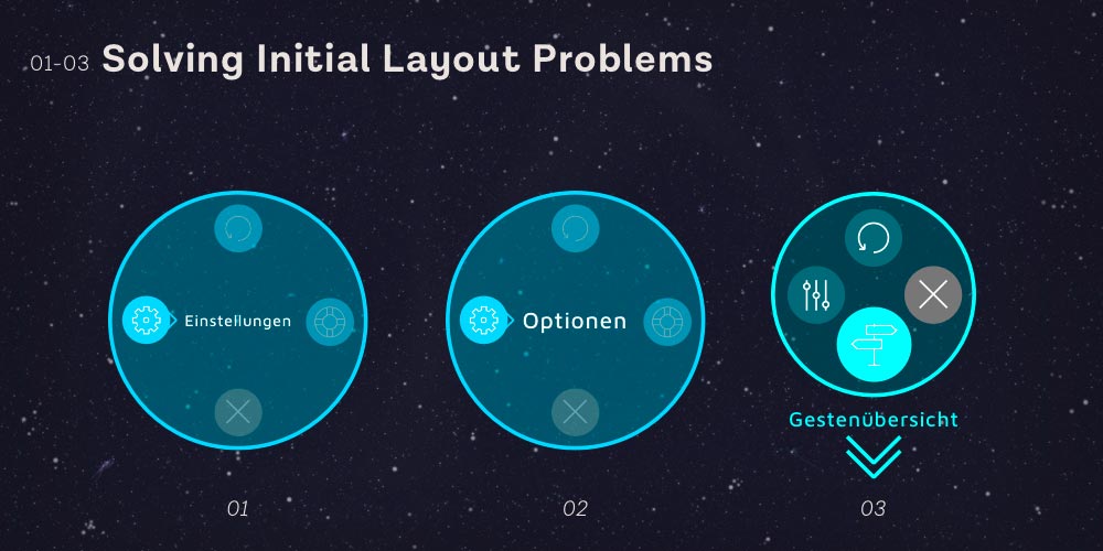
The initial idea was to have the title of a selected menu element in the center of the whole menu, but soon it became clear this would not work with longer words. It is not really scalable. By putting the word underneath the circle, the icons receive more breathing room and the word may scale in length or even in multiple lines.
-
-
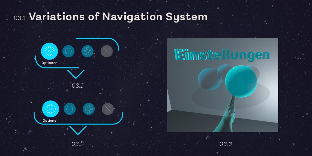
I tried several different layout styles and always came back to a more or less circular shape which seemed to be quite useful for this type of interaction and the general futuristic design of the VR app. There were also ideas to build the whole menu three dimensional itself with bubbles which could be rotated to choose an option.
-
-
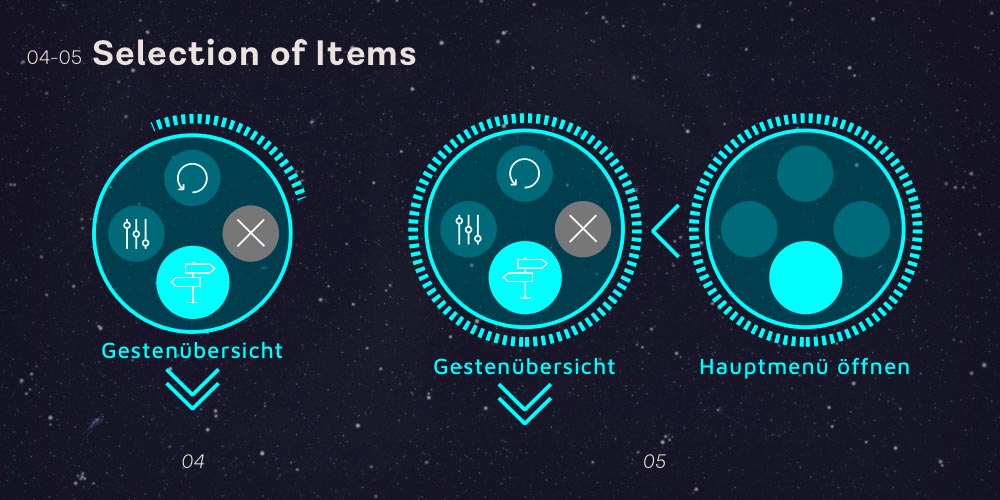
The general principle of selection in the menu is dominated by hovering with one hand over menu items. This was questioned by me because it seemed not as futuristic as I believed would be desirable. So I tried a version where the user had to scroll with a wheel-like handle to select different menu items. Nevertheless further tests showed that hovering is the most intuitive form of selecting in the context of the menu and grants a better ease-of-use.
-
-
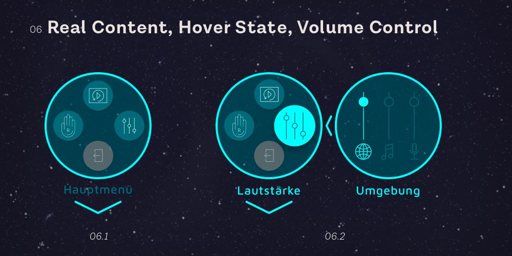
In this stage I revised the items of the menu and boiled them down to less different options for the user to choose from. The icons were edited to be more distinctive and descriptive. Also the colours were updated and the contrast enhanced.
-
-
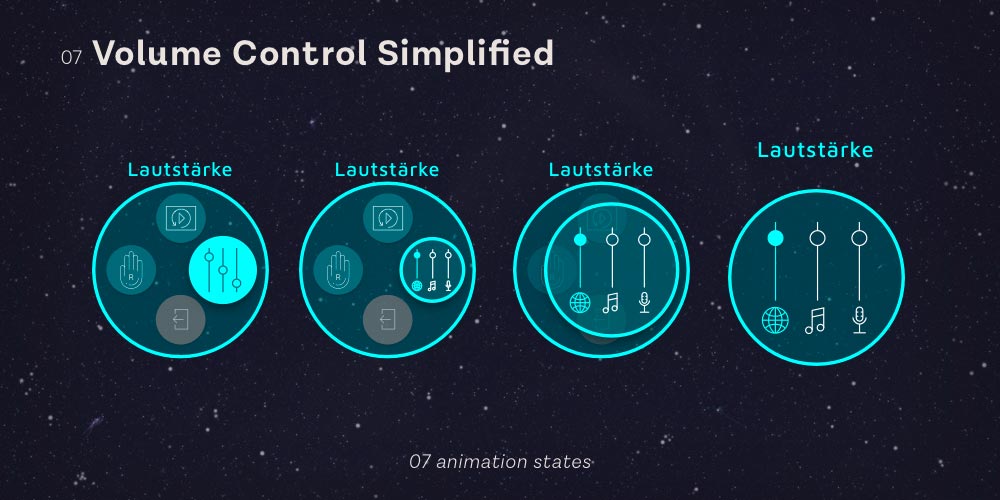
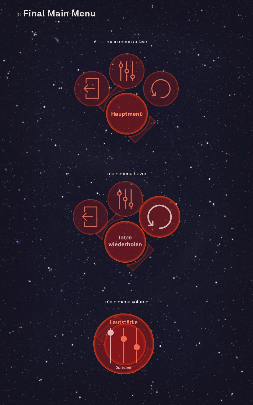
The general principle of the menu added visual clutter every time a submenu hierarchy was opened. The volume control for example opens up another window with the controls to adjust. This problem was solved by growing the volume controls from the volume icon into the whole space of the menu. This reduces the clutter and gives the user a single space to focus instead of two areas.
-
-
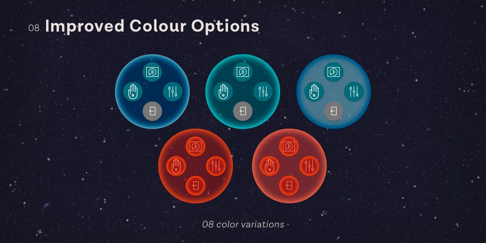
In order to differentiate the menu from other colours used in the application (like level-based indicators, earth and surface level design), I looked for a new colour scheme and found one bright red orange (the final colour for the moment).
-
-
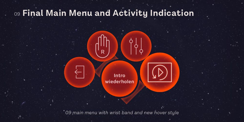
As an intermediate result this is what the menu looked like and the controls were reduced to (a) exiting the app, (b) changing the dominant hand for better navigating in the app, (c) volume controls and last but not least (d) repeating the intro in case someone missed something important and wants to replay it.
-
Context Information Creation Process:
-
-
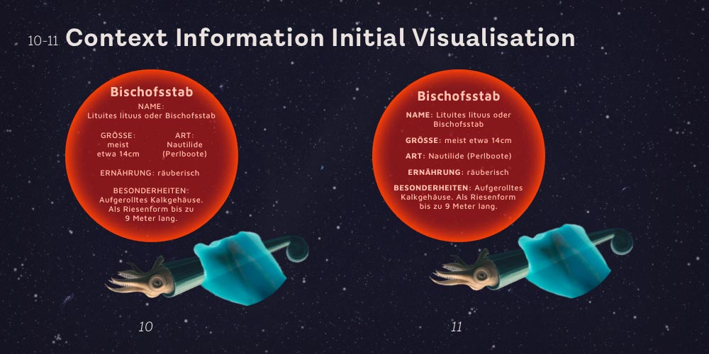
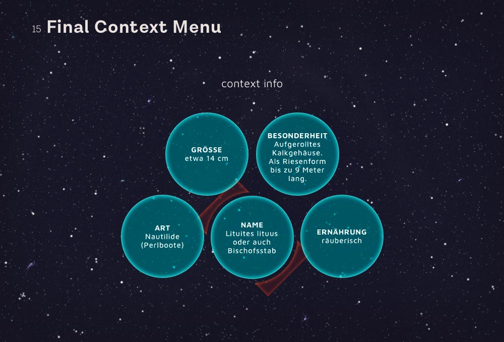
The context information system should provide the users useful information when they pick up an item in the VR app. The information consists of name, size, species, nutrition and special features about an animal which went extinct millions of years ago.
The way in which the information should be presented was not quite clear until the end. One idea was to give all the information in a floating circle next to the picked up life form. This presented the user with loads of information at once. Due to the nature of VR (relatively low resolution and shaky input mapping) this huge amount of text is really inconvenient to read. This led to the need of a better solution …
-
-
-
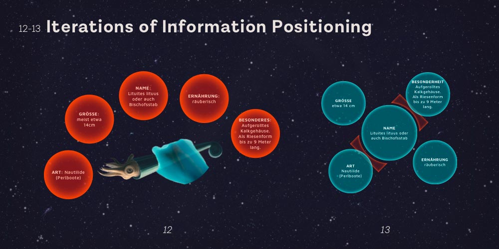
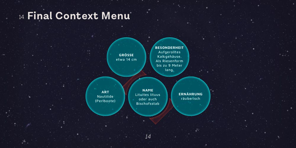
One simple way of breaking this crushing wall of text is to give each information bit its own circle. In this way each section can be read on its own and users can better decide which information they want to read and which not.
In contrast to the positioning directly on the object, the second version uses the wristband (watch) as an anchor point for the information. This brings the advantage of (a) a familiarity to the main menu, thus recognition and confidence for the users – as they learned this watch is a point of interest and multifunctional interaction. And (b) it gives users a sense of orientation in the overwhelming VR environment, because their arms1 seem like a hub they can always refer to. 1 In contrast to an additional and fully fictional new element which floats in front of their face and moves along as their hand shakes and moves. This is also for the sake of stability and a try to reduce sensual overload.
In the end the context information is quite similar to the main menu in its visual representation, except there are no icons and the colour is different.
-
Skip Indicator Creation Process:
-
-
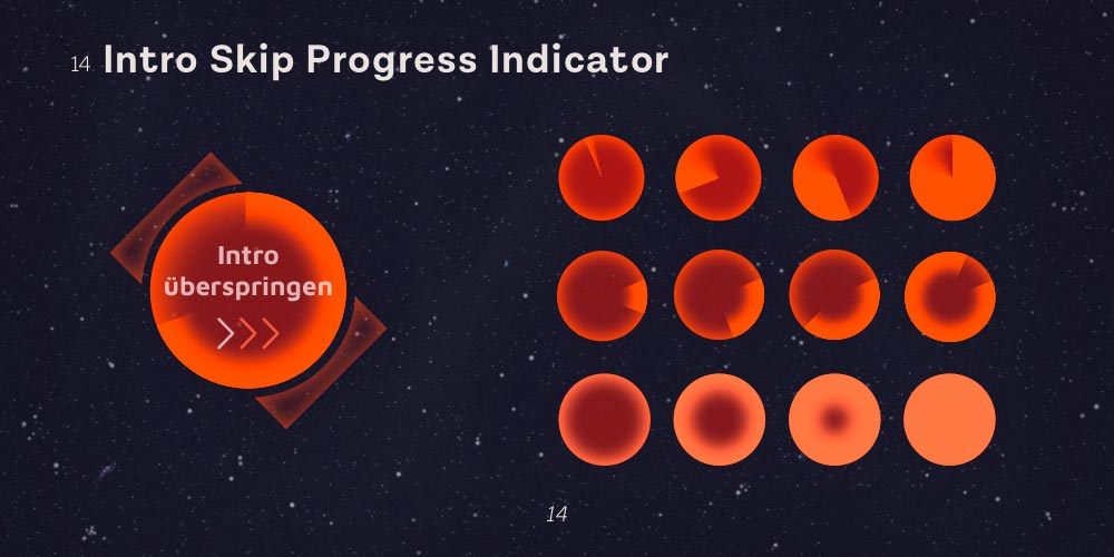
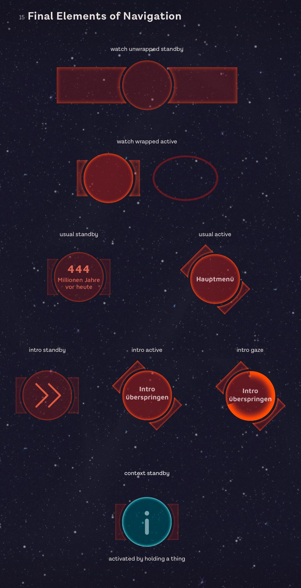
As an addition to the main menu and context info, there is a little function to skip a current intro. This function utilises gaze control to verify the action. Users have to raise the watch into their field of view and hold it there for several seconds to make sure they do not accidentally skip something. Even for this simple action the possibilities of giving feedback to the user were plentiful, yet the simple loader seemed to be the best bet because of familiarity (from the web but also from the real world).
-
All Navigation Elements and States:
-
-
The final design features a less aggressive colour choice and refined options for the main menu. The concept is similar to a smart watch which is raised to turn the screen on. The watch needs to be raised to reveal the menu. In its passive state (standby) it is a simple watch which displays the current time of the level in the VR app. Upon raising an arm the main menu opens up and the opacity increases for better readability of the contents.
-
-
-
As I already mentioned earlier, the options of the main menu were changed in the last step. In the initial designs the main menu was limited to the left watch and the context info to the right wristband. To make it easier for left-handed users, there was an option to change this default orientation.
After rethinking the use case for the main menu and the context information system, it didn't make any sense to have them separated because they would never be used at the same time. For example the context info would only open when a user holds an item from one of the app levels in their hand. There would never be the need of opening a menu in just that second.
So I decided to change the general function of the menu to allow every action with every arm – this supports the ease-of-use approach of the design a lot better. When users see an intro, they can not open the menu, nor see any context information, just use the wristband as skip-this-intro function. In case they are holding an item, they can only see the context information upon raising their arm. Which brings us to all other cases, in which they can use the main menu functionality.
-
Bottom Line:
-
This project, in combination with the VR app project, helped me to develop a better understanding of the iterative design process which is necessary in order to get closer and closer to a well designed user experience. User needs and ergonomics, but also user expectations played a great role in these projects and I am really honored to have had the opportunity of working on this project.
Although my roots used to be in graphic (meaning static) design, this project was a perfect exercise in terms of questioning the proven standards, the initial ideas of my mind and working on a system which would be used by humans interactively.
Thanks go to Thomas Conrad and Enni Vuong, my team members for the VR app project and the MSD for the support and supervision during the project.