Dots + Lines
July 2017, Münster School of Design
Endeavour
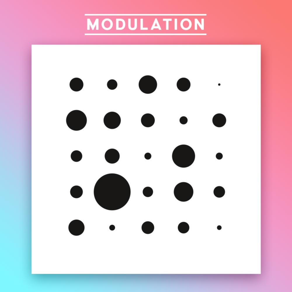
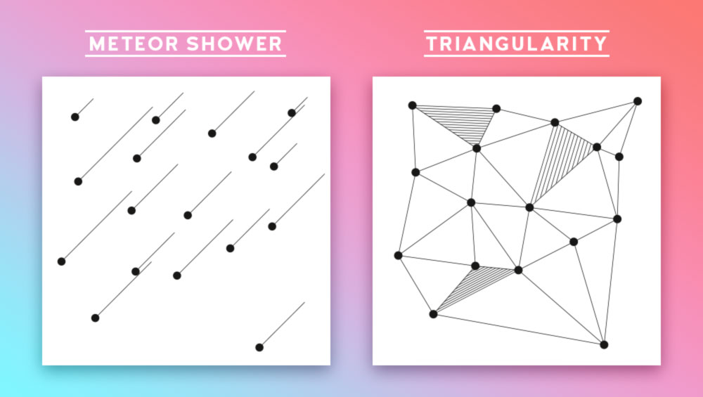
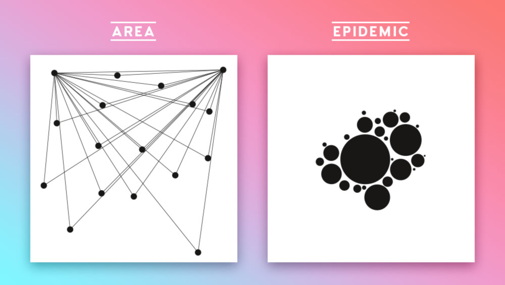
With different guidelines dots and lines should be placed in a square making visually pleasant compositions or expressing something.
Solution
It was crucial to train the eye to aesthetic principles and basic gestalt principles in the beginning of the curriculum. These images are a selection of several dozen works. The title of each individual piece is written above it.
Scope
Layout, Aesthetics, Basic Principles


